
Why Does My Paint Color Look Different on the Wall?
I hate to break it to you, but that paint color you fell in love with on Instagram or Pinterest? The one you painstakingly tracked down by name and brand? It probably won’t look anything like that on your wall. (Same goes for catalog and magazine photos. The color just won’t match.) Here’s why.
Reason#1: Screen Calibration
Different screens display colors differently. Don’t believe me? Pull up the same image on your phone, laptop, and tablet. Notice how the colors shift? That’s because each screen has its own calibration, brightness, and color balance settings. So, the gorgeous warm gray you saw on your phone might read as cool and flat on your laptop—and neither version is an exact match for real life.
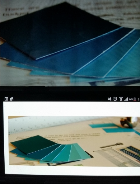
There are calibration devices out there that will make sure you get the perfect image, but they can get expensive and still may not solve the problem because…
Reason#2: Color Correction & Editing
Even the best photographers tweak images to enhance brightness, contrast, and clarity. And catalog publishers? They go all-in on editing to ensure the products look perfect—sometimes at the expense of the wall color’s accuracy. The same goes for social media influencers who use filters to create a specific aesthetic. (Yes, even #nofilter posts usually get a little touch-up.)
Reason #3: Printing & Ink Variations
If you’re pulling inspiration from a magazine or catalog, know that print colors are at the mercy of ink variations. Ever noticed how some pages lean too pink or yellow? Even small shifts in ink balance can alter how a color looks on the page, making it nearly impossible to match exactly.

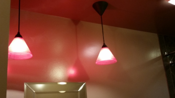
Reason #4: Lighting in the Inspiration Photo
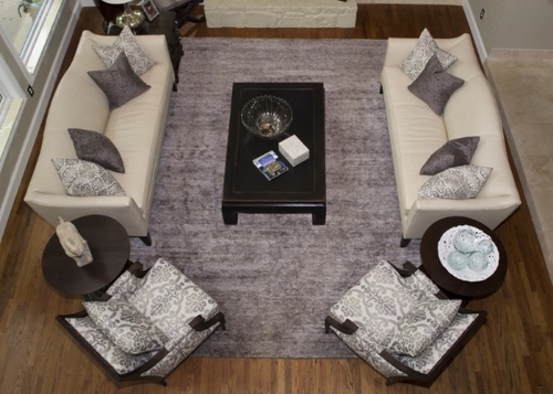
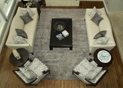
Lighting dramatically impacts color. Natural daylight, warm incandescent bulbs, and cool LED lighting all affect how a paint shade reads in a space. I once took two photos of the same wall—one in bright daylight, one under evening artificial light—and they looked like completely different colors. To make things even trickier, shadows and reflections from furniture or décor can subtly shift how a color appears.
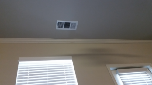
Reason #5: Lighting in Your Space
Even if the inspiration photo was taken in perfect lighting, your home has its own unique setup. Factors like:
- North- vs. south-facing windows
- Overhead vs. accent lighting
- Nearby reflective surfaces (like a blue rug or bright greenery outside your window)
- The color temperature of your bulbs
…can all shift how a paint color looks in your actual space.
So, How Do You Get the Right Color?
Forget about relying solely on the name of a paint color from an inspiration photo. Instead, match your selection to how the color actually looks in the photo—but don’t stop there. Always test large swatches in your own space, at different times of day, under the lighting you actually use. That’s the only way to ensure the color works for you.
Need help making sure all the details of your project come together seamlessly? Let’s talk!
Filed Under:
